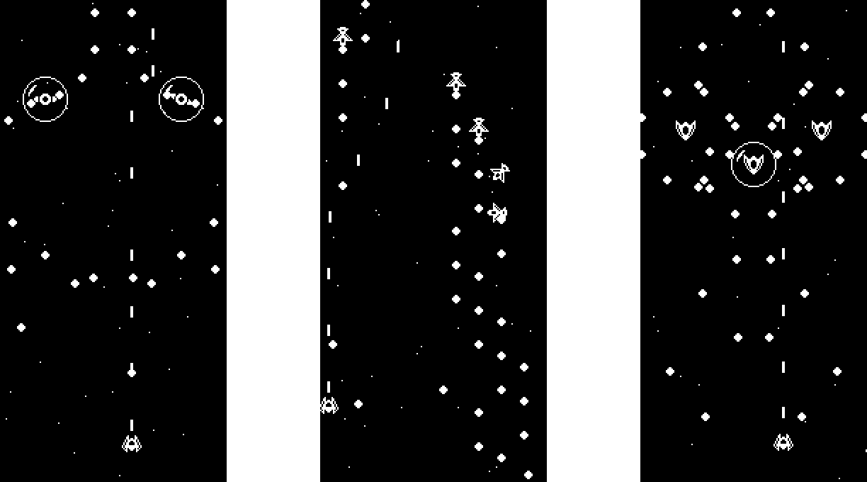
space/time
Two steps forward, one step back. Two steps forward, one step back. You got this, Alex.

Summary:
space/time is a solo project made over a weekend for Extra Credits's "cycles" jam. Whenever you take damage, you warp back in time a few seconds to try again. If you're a fan of scrolling shooters, fast-paced action, or exactly 2 colors, give this game a shot.

Resources Used:
Music: "Boss Battle #3" by nene
Sound Effects: "512 Sound Effects (8-bit style)" by SubspaceAudio
Controls:
- [Arrow Keys] - move
- [Z] - toggle between window sizes
- [Enter] - start
| Status | Released |
| Platforms | HTML5 |
| Author | Ryan Wires |
| Genre | Shooter |
| Made with | GameMaker |
| Tags | 1-bit, 2D, Bullet Hell, GameMaker, Space |


Comments
Log in with itch.io to leave a comment.
Whoah, nice! I didn't expect such an excellent game from the visuals, but it rocks!
Good job!
Full screen mode would be nice. And some incentive to replay.
Thanks for playing! The visuals are a downfall of working solo I guess. I'm a programmer first and foremost lol. And agreed on both counts. Some randomization would help, as would a death counter per run.
Don't get me wrong, -- the visuals are acutally pretty neat in their simplicity, it's a matter of the platform. On Steam, I would have suggested that the game will be great despite or even due to the simple and readable visuals, on itch, the genre of the shmups with simple visuals, especially within the free games section, is just a matter of different expectations, which has nothing to do with your game at all. So no change is really needed.
And I really DO NOT think that randomization would do the game a favor, the opposite is the case. I think rather that some sort of additional 'expert mode' run or ... I don't know exactly, just some incentive to play again, whatever it may be. But I wouldn't the change the existing run through the game much for it. I guess, maybe this incentive is actually *not* right. The game does a fantastic job exactly the way it is. It's just a players thing to always *request more* of something that's good the way it is.
So... good job exactly as it is :-)
Really great game! Loved the style of it :D If i would have any criticism that might be to have something that showed your progress so that you had some kind of goal :)
Glad you liked it! I bet some kind of progress bar along the side could work well for that. Seeing it freeze and rewind during the hit animation would be super neat.